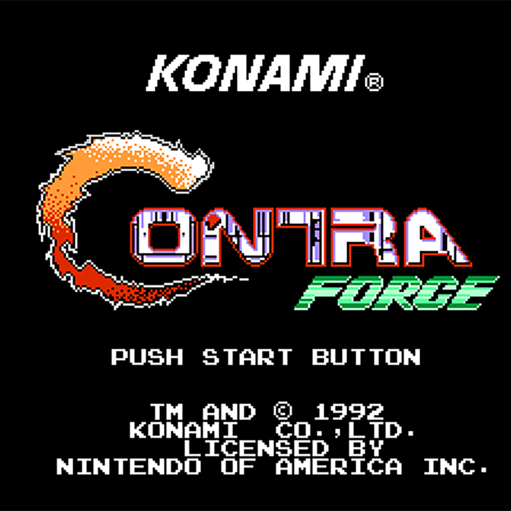
Reimagining a 1992 NES game through reference-driven, AI-assisted character and boss design.
Project type: Visual Reconstruction / Character & Boss Design Study
Source material: Contra Force — Nintendo Entertainment System, 1992
Original developer and publisher: Konami
Focus: Character Design, Boss Design, Visual Development, Pixel-Art Interpretation
Method: Reference-driven, AI-assisted visual reconstruction
Status: Personal creative and technical study
Classification: Unofficial fan-made project
Overview
Contra Force — AI-Assisted Visual Reconstruction is a personal visual-design study based on the 1992 Nintendo Entertainment System game Contra Force.
The project explores how characters, bosses, weapons, equipment, and other visual elements originally represented through highly constrained 8-bit pixel art can be translated into a more detailed modern visual language.
The objective was not to create a new Contra Force game, nor to present AI-generated images loosely inspired by the franchise.
Instead, I approached the original game as source material for a structured reconstruction exercise.
I worked through the cast and major boss designs individually, starting from their original pixel-art representations and progressively expanding them into more detailed visual interpretations.
Across the project, this process evolved into material resembling modern character-design and game-development documentation, including:
- character portraits
- full-body designs
- front and rear views
- alternate viewing angles
- action poses
- weapon studies
- equipment details
- visual identity studies
- color and material exploration
- pixel-art references
- boss design studies
- attack and behavior concepts
- stage/context concepts
- character-sheet-style presentations
The result sits somewhere between visual reconstruction, concept design, and game-art research.
AI was used as a creative tool within that process, but the project was built around the original game references, visual direction, comparison, selection, refinement, and human-guided design decisions.
The Original Game
Contra Force is a run-and-gun action game developed and published by Konami for the Nintendo Entertainment System and released in North America in 1992. It is generally treated as a spin-off of the Contra series rather than a direct continuation of the main storyline.
Unlike the alien-focused conflicts associated with many other Contra titles, Contra Force centers on a human counter-terrorism unit operating in Neo City.
The playable team consists of four specialists:
- Burns — team leader
- Smith — sharpshooter / long-range specialist
- Iron — heavy-weapons specialist
- Beans — demolition specialist
Each character has different weapons and physical characteristics, giving the player more tactical variation than a simple visual character swap.
The game contains five stages and alternates between traditional side-scrolling action and overhead-view stages. This combination, along with selectable specialists and a power-selection system, distinguishes Contra Force mechanically from several earlier entries in the series.
An Interesting Development History
Contra Force also has an unusual place in Konami history.
The project was originally planned for Japan under the title Arc Hound, without a connection to the Contra franchise. That Japanese release was cancelled, while the project was subsequently adapted for the North American market as Contra Force.
This history helps explain why the game feels visually and narratively different from more conventional Contra titles.
Instead of futuristic alien warfare, the game presents:
- human antagonists
- contemporary weapons
- military and paramilitary characters
- urban environments
- aircraft
- warehouses
- ships and submarines
- terrorist organizations
- specialist members of a tactical team
For a reconstruction project, that difference is particularly interesting.
The visual vocabulary is closer to a stylized early-1990s military action film than to science-fiction creature design.
Why Pixel-Art Reconstruction Is Interesting
An 8-bit sprite contains much less information than a modern character illustration.
That limitation is precisely what makes reconstruction interesting.
A sprite may communicate:
- silhouette
- approximate clothing
- dominant colors
- posture
- hairstyle
- weapon category
- body proportions
- a few distinctive accessories
But it often cannot communicate:
- exact materials
- facial structure
- realistic anatomy
- stitching
- equipment construction
- rear clothing details
- weapon mechanics
- small accessories
- surface wear
- fabric texture
- armor construction
- insignia
- realistic lighting
- details hidden by the viewing angle
When translating that sprite into a modern design, those missing areas create an important distinction between reconstruction and invention.
This project intentionally works inside that boundary.
Reconstruction vs. Reinterpretation
The term visual reconstruction is useful here, but it requires an important qualification.
I am not claiming that these images reveal what Konami’s original artists definitively intended every character to look like in realistic detail.
An 8-bit sprite simply does not contain enough information to make such a claim.
Instead, the project operates across three levels of visual information.
1. Source-Derived Elements
These are elements that can be identified directly from the original game material.
Examples can include:
- general color scheme
- silhouette
- hairstyle
- clothing category
- visible accessories
- character build
- weapon type
- distinctive visual markers
These elements form the foundation of the reconstruction.
2. Inferred Elements
Some details are not explicitly visible but can reasonably be inferred from the source.
For example, a few pixels may suggest:
- a tactical vest
- a military cap
- boots
- ammunition equipment
- straps
- armor
- a particular weapon configuration
Modernizing the design requires interpreting those visual signals.
3. Interpretive Elements
Finally, some details simply do not exist in the original sprite.
These can include:
- realistic fabric construction
- rear-view details
- facial features
- equipment attachment systems
- surface materials
- weathering
- small insignia
- mechanical weapon detail
- clothing seams
- modernized tactical components
These elements are design interpretations, not recovered canonical information.
That distinction is important throughout the project.
AI as a Tool, Not the Subject
Although AI-assisted image generation is part of the workflow, the project is not intended as a collection of unrelated AI artwork.
The more interesting problem is the translation process.
The source already exists.
The characters already exist.
Their roles already exist.
Their visual identities already exist, although only at very low resolution.
The challenge is therefore not:
“Generate a cool military character.”
It is closer to:
“Given this specific low-resolution character from a 1992 NES game, what visual decisions are necessary to transform that source into a coherent modern design without losing the identity of the original?”
That changes the role of AI.
AI becomes one component of a broader process involving:
reference → interpretation → visual direction → generation → comparison → iteration → selection → reconstruction
The human role remains important because every additional detail introduces a design decision.
Maintaining Visual Identity
The objective was not photorealism for its own sake.
A reconstruction can become technically impressive while losing the character it is supposed to represent.
For that reason, recognizable source characteristics remain more important than arbitrary complexity.
A successful result should ideally allow someone familiar with the original game to understand:
This is a modern interpretation of that specific character.
The process therefore attempts to preserve the visual anchors provided by the NES artwork while allowing additional detail where the original resolution provides insufficient information.
The C-Force Team
One of the most distinctive aspects of Contra Force is its four-member playable team.
Rather than giving every playable character essentially the same function, the game assigns different combat specialties and weapon sets to each member.
That makes each character a separate reconstruction problem.
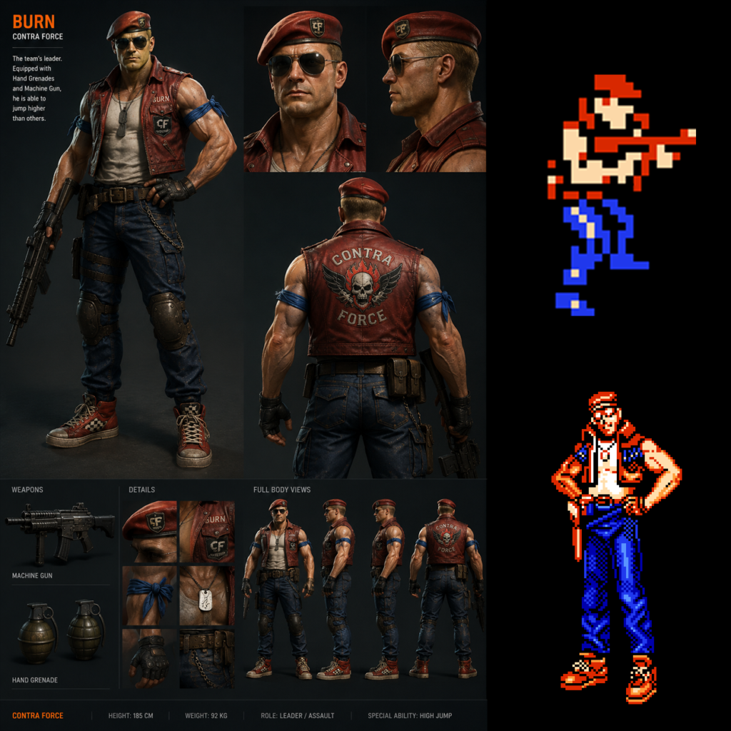
Burns
Role: Leader of C-Force
Combat identity: General assault / leadership
Original design type: Playable character
Burns is the principal protagonist and leader of C-Force. Contra reference material associates him with a machine gun and hand grenades, while his movement characteristics include particularly strong jumping ability.
Reconstruction Focus
The reconstruction treats Burns as the visual anchor for the entire team.
His design explores how the relatively small NES reference could be expanded into a complete character sheet while retaining the recognizable visual language of the original.
The resulting study includes areas such as:
- full-body appearance
- portrait views
- side profile
- rear view
- clothing details
- equipment
- weapon presentation
- boots and accessories
- insignia
- tactical elements
- multiple viewing angles
Expanding the character into front, side, and rear views also forces the reconstruction to solve information that was never explicitly represented by the original sprite.
That is one of the central design problems explored throughout this project.
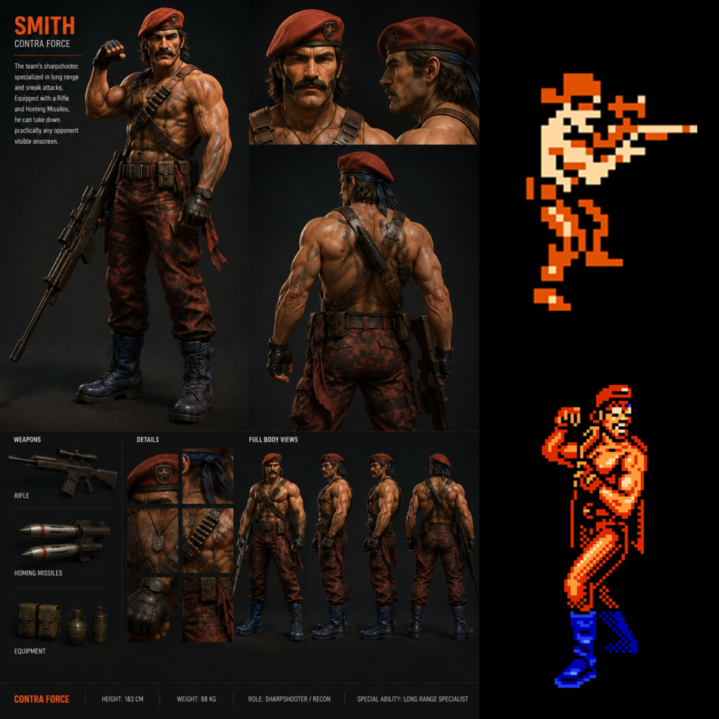
Smith
Role: Sharpshooter
Combat identity: Long-range specialist
Original design type: Playable character
Smith is C-Force’s expert sharpshooter and long-range combat specialist. His available arsenal includes weapons such as a pistol, rifle, and homing missile.
This role provides an important distinction from Burns.
Reconstruction Focus
Smith’s visual reconstruction is therefore approached around precision rather than raw firepower.
The design language can emphasize:
- ranged combat
- weapon accuracy
- specialist equipment
- controlled silhouette
- marksman identity
The challenge is to communicate this role visually while still making Smith clearly belong to the same C-Force unit as the other characters.
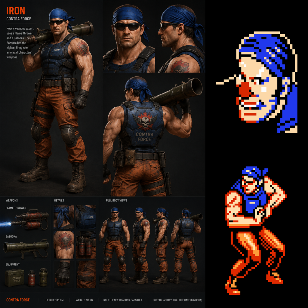
Iron
Role: Heavy-weapons specialist
Combat identity: Firepower / heavy assault
Original design type: Playable character
Iron is the team’s heavy-weapons specialist and the physically largest of the four playable characters. His equipment includes heavier weapons, while his movement is correspondingly less agile than that of some other team members.
Reconstruction Focus
Iron provides an opportunity to explore visual mass.
Compared with Smith, the character benefits from a different design vocabulary:
- heavier silhouette
- greater physical mass
- larger weapons
- reinforced equipment
- increased visual weight
- reduced emphasis on agility
This is an example of how reconstruction is not simply about adding resolution.
The role of the character should remain visible in the resulting design.
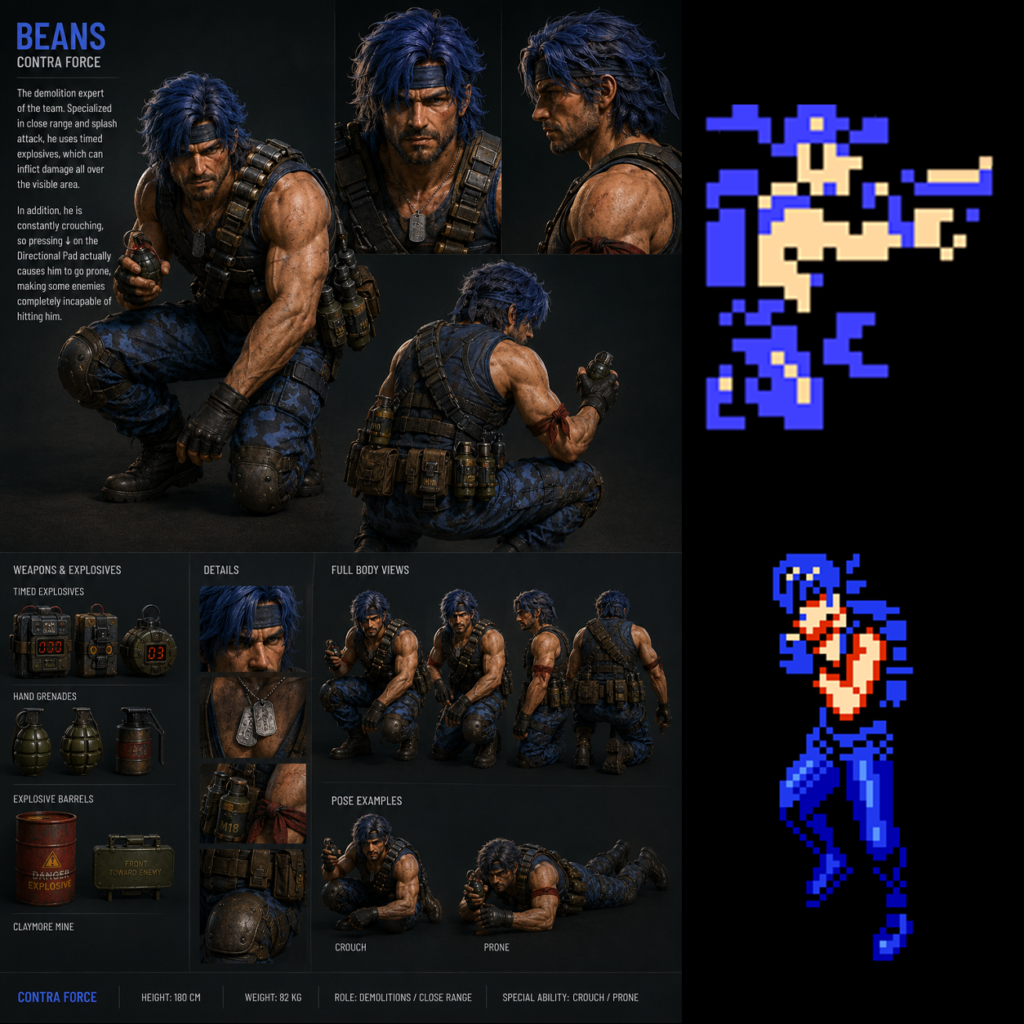
Beans
Role: Demolition specialist
Combat identity: Explosives / tactical demolition
Original design type: Playable character
Beans is the demolition specialist of C-Force and uses explosives such as bombs and mines as part of his combat role.
Reconstruction Focus
Beans therefore creates another distinct equipment problem.
Rather than being defined primarily by rifles or heavy weapons, his design can be explored through:
- demolition equipment
- explosives
- tactical storage
- specialized accessories
- deployable devices
Taken together, Burns, Smith, Iron, and Beans create four related but distinct visual archetypes.
That diversity makes the original C-Force team especially suitable for a character-design reconstruction study.
Boss Reconstruction
The same reconstruction methodology was extended beyond the playable team.
Several bosses were also interpreted from their original pixel-art appearances.
Boss reconstruction presents a slightly different challenge.
Playable characters appear repeatedly and generally have clearer identities. Bosses may have far less source material available.
This means the ratio between source information and interpretive design can become much more demanding.
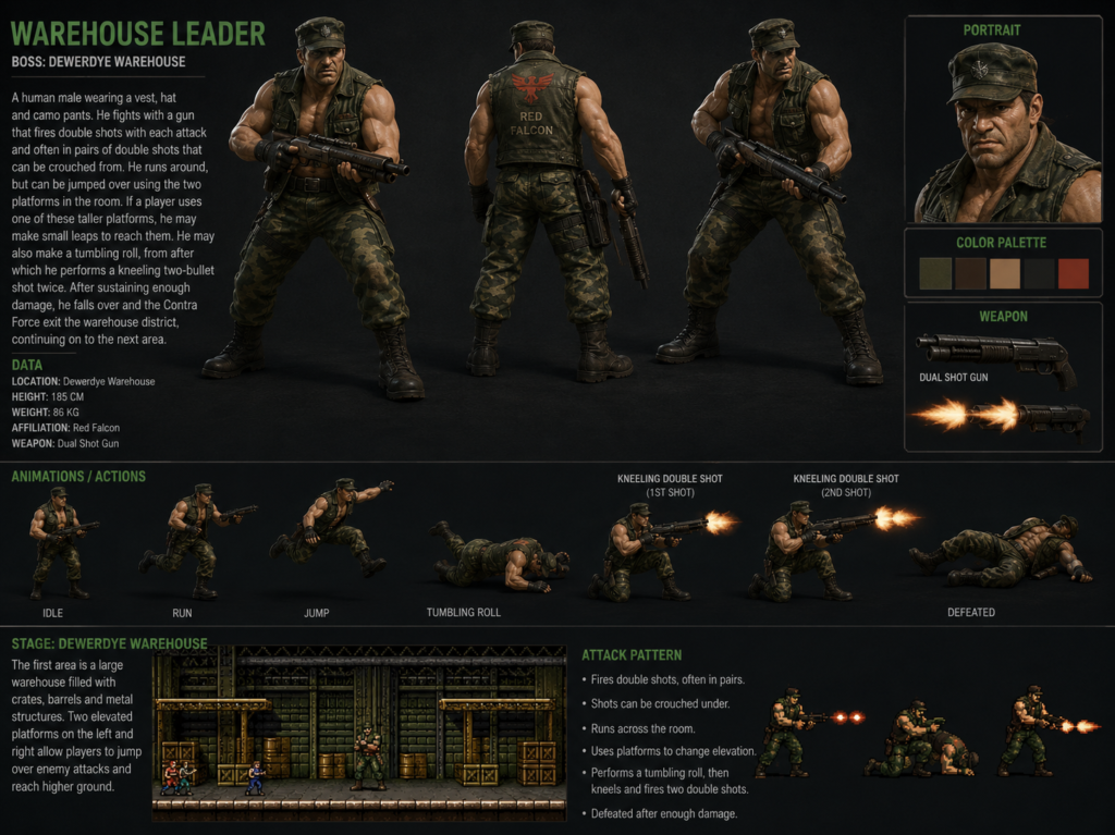
Warehouse Leader
Encounter: First major boss
Design type: Human enemy
The Warehouse Leader is identified as the first boss of Contra Force. The original design depicts a human combatant associated with the warehouse encounter.
Reconstruction Focus
The challenge is to expand a relatively small enemy sprite into a character capable of carrying the visual presence expected from a modern boss design.
Rather than changing the character into something unrelated, the reconstruction attempts to preserve the recognizable structure of the source while increasing:
- clothing detail
- weapon detail
- material definition
- silhouette readability
- facial identity
- equipment logic
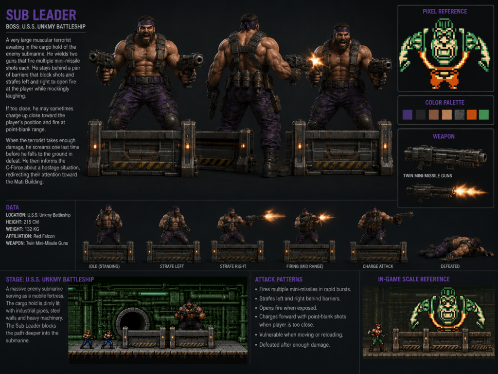
Sub Leader
Encounter: Second boss
Design type: Human enemy
The Sub Leader is the game’s second boss and is depicted as a very large, muscular combatant encountered in the cargo hold of an enemy submarine.
His physical size is already an important part of the original identity.
Reconstruction Focus
This makes body mass and physical presence primary design elements.
The modern interpretation can develop:
- muscular proportions
- dual-weapon combat identity
- heavy stance
- aggressive posture
- combat equipment
- visual intimidation
Here, the NES limitations actually provide a useful design constraint: the original silhouette already communicates much of the character’s intended role.
The reconstruction expands that signal rather than replacing it.
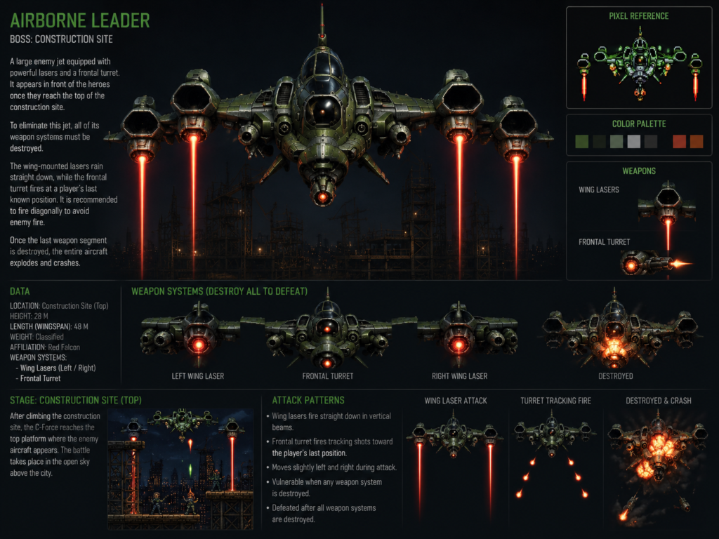
Airborne Leader
Encounter: Third boss
Design type: Aircraft
Not every boss is a humanoid character.
The Airborne Leader is the third boss and is represented as a large combat aircraft equipped with laser weapons and a frontal turret.
Reconstruction Focus
This changes the reconstruction problem from character design to vehicle and mechanical design.
Questions now involve:
- aircraft silhouette
- weapon placement
- mechanical structure
- scale
- armor
- propulsion
- cockpit interpretation
- surface materials
- believable integration of the original weapon systems
The Airborne Leader demonstrates how the project extends beyond portraits and human character reconstruction into broader game-design visualization.
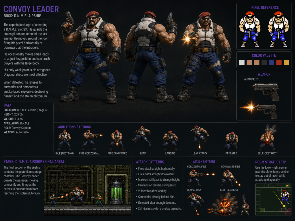
Convoy Leader
Encounter: Fourth boss
Design type: Human commander / aircraft-related encounter
The Convoy Leader is identified as the fourth boss and a D.N.M.E. captain associated with an enemy aircraft and stolen plutonium.
Reconstruction Focus
This design allows the project to explore a higher-ranking antagonist rather than a generic combat unit.
Visual reconstruction can therefore consider elements such as:
- command presence
- rank
- equipment
- military identity
- antagonist hierarchy
Again, details beyond the source sprite should be understood as interpretation rather than recovered canonical design.
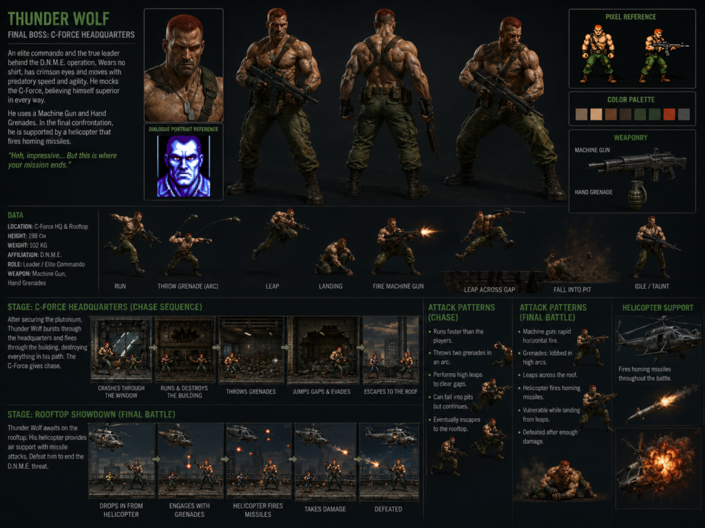
Thunder Wolf
Encounter: Final boss
Design type: Primary antagonist
Thunder Wolf serves as the final boss and is identified as the leader behind the terrorist operation opposed by C-Force.
Reconstruction Focus
Because Thunder Wolf represents the final antagonist, his visual design carries a different narrative responsibility.
The reconstruction needs to communicate more than combat capability.
It should communicate authority.
Relevant design considerations include:
- silhouette hierarchy
- visual dominance
- command presence
- antagonist identity
- equipment
- posture
- final-boss visual weight
Thunder Wolf therefore becomes an appropriate endpoint for the character reconstruction sequence.
From Individual Images to Design Sheets
As the project developed, the outputs expanded beyond single images.
A standalone portrait answers only one question:
What might this character’s face or general appearance look like?
A character sheet asks many more:
- What does the character look like from behind?
- Does the clothing remain coherent from every direction?
- Where is equipment mounted?
- How does the weapon relate to the body?
- What materials are implied?
- Which details are essential to recognition?
- Which elements are interpretation?
- Does the design remain consistent across multiple views?
- Can another artist understand the design from the sheet?
Those questions move the exercise closer to visual development documentation.
Some reconstructed sheets therefore include combinations of:
Character Views
- front view
- side view
- rear view
- three-quarter view
- portrait
- profile
- action pose
Equipment Studies
- firearms
- grenades
- explosives
- tactical accessories
- belts
- pouches
- protective equipment
Design Details
- clothing
- insignia
- footwear
- gloves
- accessories
- material close-ups
- color relationships
Boss-Specific Material
- attack concepts
- weapon systems
- movement behavior
- scale
- environmental context
This is why I describe the project as more than a sequence of generated images.
The objective gradually became to create a coherent visual system around each source design.
Reference-Driven AI Work
Generative AI makes it extremely easy to create something visually impressive.
It is much harder to make the result obey a specific reference.
Reference-driven reconstruction introduces constraints that open-ended generation does not have.
For every design, there are effectively two competing objectives:
- Increase visual information
- Avoid destroying the identity contained in the original information
Too little interpretation produces something that remains visually incomplete.
Too much interpretation produces a completely different character.
The useful space lies between those extremes.
Consistency Across a Reconstructed Cast
Another challenge appears once several characters have been reconstructed.
An individual image can look convincing while still being inconsistent with the rest of the project.
A team should appear to belong to the same world.
That means considering shared visual language across:
- material realism
- costume construction
- weapon detail
- lighting
- proportions
- presentation
- tactical vocabulary
- image composition
- level of detail
This becomes increasingly important when reconstructing not one character but an entire set of protagonists and antagonists.
The project therefore becomes a system-level visual-design exercise, rather than nine unrelated images.
What This Project Is
This project can accurately be described as:
AI-Assisted Visual Reconstruction
Reference-Driven Character Design
Character & Boss Reinterpretation
Visual Development Study
Pixel-Art-to-Modern-Design Experiment
AI-Assisted Creative Technology Experiment
Each of those descriptions captures part of the work.
What This Project Is Not
Equally important is what the project does not claim to be.
It is not presented as:
- an official Konami project
- an official redesign of the characters
- canonical character artwork
- recovered original concept art
- a replacement for the original designs
- a remaster of the NES game
- a complete remake of Contra Force
The distinction matters.
Reconstructing the visual design of game assets is not the same as rebuilding the game.
The purpose of this project is visual exploration.
Human Direction and AI Assistance
I deliberately describe the work as AI-assisted rather than allowing the technology to become the entire identity of the project.
AI can propose visual solutions quickly, but a reconstruction project still requires decisions about:
- what reference to use
- what characteristics must survive
- what output is incorrect
- which details are plausible
- which details contradict the source
- what should be regenerated
- what should be retained
- how assets should relate to one another
- when interpretation has moved too far away from the original
Generation is therefore only one part of the process.
Selection and rejection are design decisions as well.
So are consistency, presentation, sequencing, and deciding where the boundary between source and interpretation should remain.
Why Document the Original References?
For every reconstructed design, showing the original pixel-art reference is important.
Without the source image, the viewer sees only a modern character.
With the source beside it, the actual experiment becomes visible.
The comparison reveals:
what information existed
versus
what information had to be interpreted.
This is why the original game imagery is an essential part of presenting the project.
It transforms the gallery from:
“Here are some AI-generated characters.”
into:
“Here is the source, and here is how I interpreted that source.”
That comparison is the core of the project.
Preservation Through Reinterpretation
There is also a broader reason I find this kind of reconstruction interesting.
Thousands of characters, vehicles, environments, enemies, and interface designs from early games exist primarily as extremely low-resolution visual information.
Those limitations were not necessarily limitations of imagination.
They were limitations of:
- display resolution
- memory
- cartridge capacity
- sprite dimensions
- palette restrictions
- hardware performance
Modern tools provide an opportunity to revisit those designs from a completely different technical environment.
The interesting question is not whether modern technology can produce more pixels.
Obviously it can.
The interesting question is:
How much additional visual information can be introduced before the design stops being the same design?
That boundary between preservation and reinterpretation is one of the ideas behind this project.
Creative Technology as an Engineering Problem
Although this is a visual project, I also view it through an engineering mindset.
A source-driven creative workflow can be treated as a constrained transformation problem.
There is an input:
original visual reference
There are constraints:
identity, silhouette, role, palette, recognizable details
There is a transformation process:
analysis, interpretation, AI assistance, iteration, evaluation
And there is an output:
a higher-information visual representation
The difficult part is not producing an output.
The difficult part is determining whether the output remains compatible with the constraints.
That makes the project relevant to my broader interest in the intersection of:
- software
- artificial intelligence
- structured workflows
- digital preservation
- visual design
- human–AI collaboration
- creative tooling
Character and Boss Studies Included
The current visual study includes work based on the following Contra Force designs:
C-Force
- Burns
- Smith
- Iron
- Beans
Bosses
- Warehouse Leader
- Sub Leader
- Airborne Leader
- Convoy Leader
- Thunder Wolf
The original character roles and boss ordering used for documentation were cross-checked against Contra Force reference material and Contra Wiki documentation.
A Note on Historical Accuracy
Where this project describes the original game, I try to distinguish historical information from my own design interpretation.
Information such as:
- character names
- character roles
- original weapons
- boss order
- game release information
- original game context
belongs to the source material.
Details created while expanding those designs into modern imagery should not automatically be interpreted as official Contra Force lore.
For example, if a modern reconstruction introduces additional clothing construction, equipment placement, realistic materials, facial features, or dimensions that do not exist in the NES reference, those should be understood as part of the reconstruction rather than canonical information.
This distinction is intentional.
Why Call It a “Visual Study”?
“Visual study” is probably the most useful description of the overall project.
It makes room for experimentation without implying official authority.
It also reflects the fact that different assets required different kinds of reasoning.
A human sprite creates one reconstruction problem.
A large boss creates another.
An aircraft creates another.
A weapon creates another.
A rear view that never existed in the original game creates another.
Together, these experiments form a study of how low-information visual artifacts can be expanded into higher-information designs using modern creative tools.
Final Perspective
Contra Force came from a completely different era of game production.
Its designers worked with hardware where every pixel mattered.
More than three decades later, generative systems can create enormous amounts of visual information in seconds.
Putting those two technological extremes together creates an interesting creative problem.
The original challenge was:
How do you communicate a character with very few pixels?
The modern reconstruction challenge is almost the opposite:
How do you add thousands of details without losing what those few original pixels communicated?
That is the idea behind this project.
Not replacing the original artwork.
Not claiming to recover an authoritative hidden design.
Not remaking the entire game.
But using modern tools to study, interpret, and expand a piece of 8-bit visual design while keeping its source visible.
Project Classification
Category: Creative Technology / Visual Development
Subcategory: AI-Assisted Visual Reconstruction
Source Era: 8-bit / NES
Primary Topics: Character Design, Boss Design, Pixel Art, Generative AI, Game Art
Methodology: Reference-Driven Interpretation
Project Type: Personal Study / Unofficial Fan Project
Suggested Tags
Contra ForceContraNESKonamiRetro Gaming8-bitPixel ArtCharacter DesignBoss DesignGame DesignConcept ArtVisual DevelopmentVisual ReconstructionAI-Assisted DesignGenerative AICreative AICreative TechnologyHuman-AI CollaborationReference-Driven DesignGame ArtDigital ArtRetro Game PreservationDesign Study
Disclaimer
This project is an unofficial fan-made visual study created for creative, technical, and portfolio purposes.
Contra Force, Contra, the original characters, game artwork, names, logos, and related intellectual property are associated with their respective rights holders, including Konami.
The reconstructed images presented in this project are independent visual interpretations based on original game references.
They are not official artwork, canonical redesigns, recovered concept art, or an official remake of the game.
This project is not affiliated with, sponsored by, approved by, or endorsed by Konami.
All references to the original game are used to identify and document the source material on which the visual study is based.
Source Notes
Historical and character information was cross-checked using documentation for Contra Force, including material describing its 1992 NES release, its origins as the cancelled Japanese project Arc Hound, its four-character C-Force roster, and its gameplay structure.
Character and boss information was additionally checked against individual Contra Wiki entries for Burns, Smith, Iron, Beans, Warehouse Leader, Sub Leader, Airborne Leader, Convoy Leader, and Thunder Wolf.